


Purpose: To develop the visual identity for a new winery, Edgewood Estates.
Problem: No existing brand recognition.
Collaborators: Winery co-owners.
Steps: Brand strategy, logo design, wine label design.
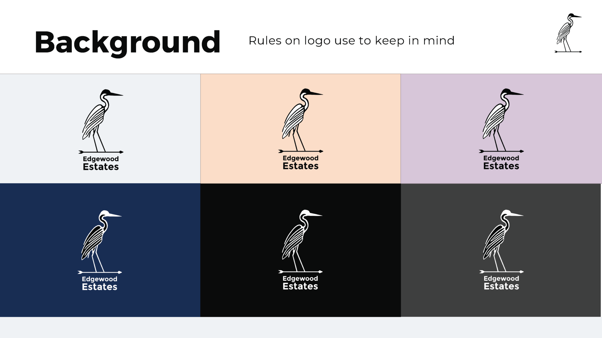
Impact: The logo, featuring a heron, conveys the winery’s elegance and balance. The vibrant color palette, featuring muted pastels, reflects the playful spirit of the bottled wine varietals. Purple, a signature color representing the winery’s Westbrook, CT roots, is used throughout the branding.
Custom icons were designed for taste, smell, and pairing suggestions on the labels. Montserrat, a geometric sans-serif typeface, was chosen for its high readability and versatility. Playfair Display, a serif font, complements the modernity of Montserrat and adds a classic touch.
