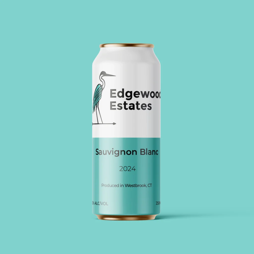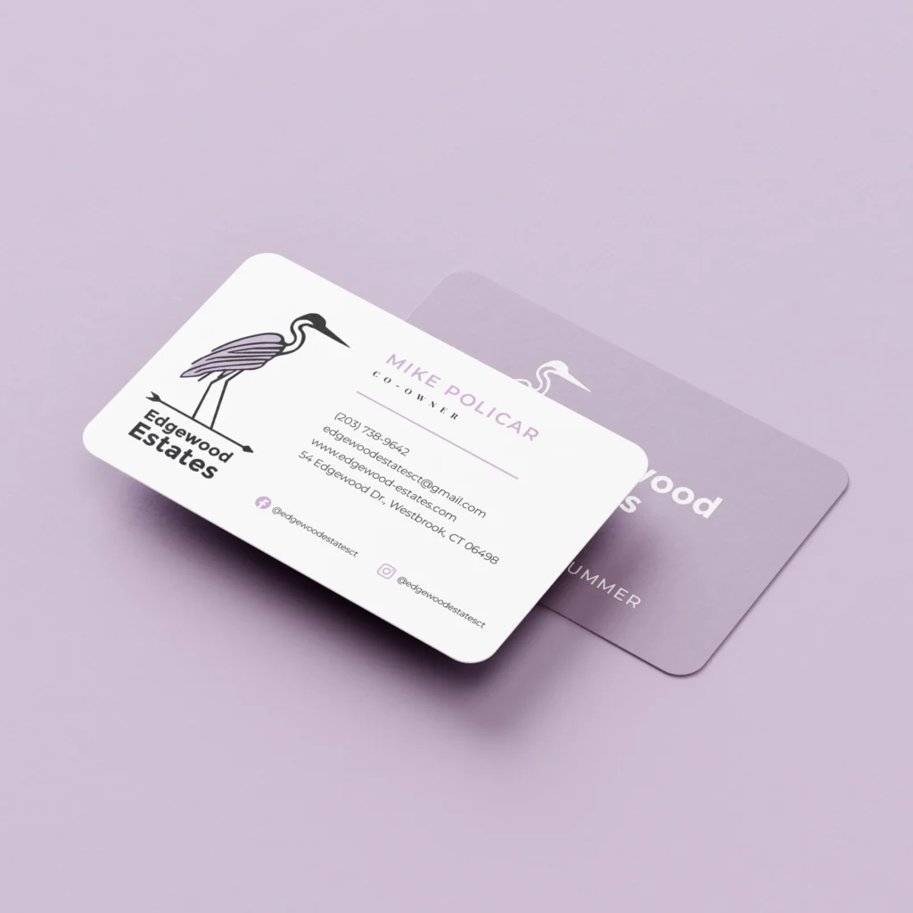
Edgewood Estates, a new Connecticut winery, approached me to create a brand identity that would resonate with their target audience of young locals and tourists visiting the coastal region, while balancing relaxed elegance with sophisticated appeal. Their primary goal was to build a loyal customer base.
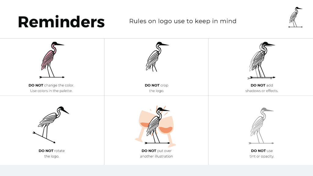
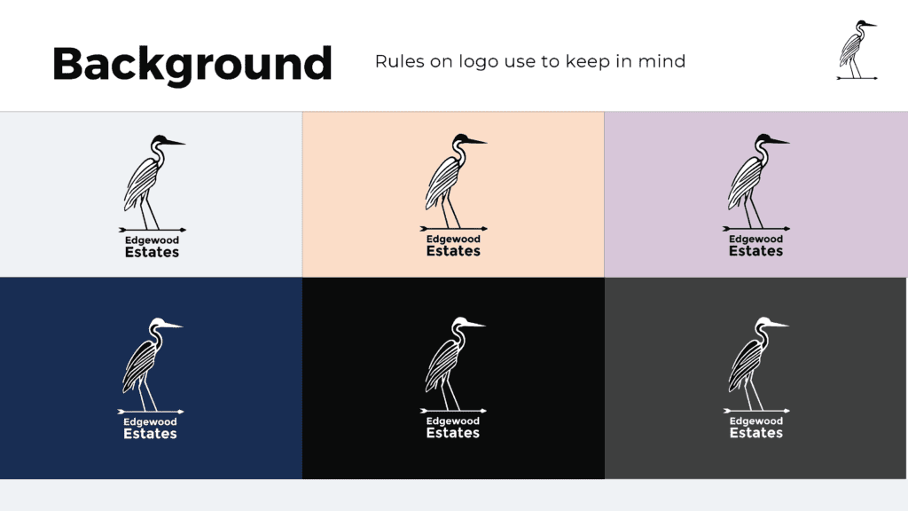
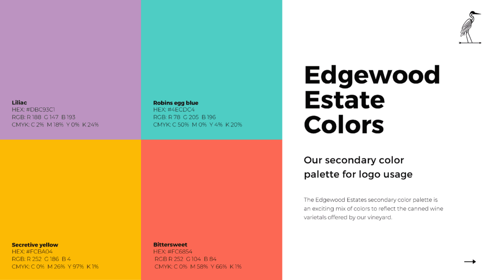
My design solution centered around a heron, observed on the winery barn, which symbolized the estate’s natural beauty and the cyclical nature of winemaking, connecting with the local environment. The brand palette, incorporating the town’s signature purple and muted pastels, was chosen to complement the vibrant colors of the wines themselves and evoke the coastal landscape.
Custom icons were designed for the back of the wine bottles and can labels to communicate taste, smell, and pairing suggestions, enhancing the customer experience and making the wines more approachable for a younger audience. The typography (Montserrat and Playfair Display) was selected to convey both modern sophistication and classic winemaking traditions, appealing to a broad range of tastes.
